Opened 4 years ago
Closed 4 years ago
#6902 closed enhancement (fixed)
Improve AlphaFold PAE plot appearance
| Reported by: | Owned by: | Tom Goddard | |
|---|---|---|---|
| Priority: | moderate | Milestone: | |
| Component: | Structure Prediction | Version: | |
| Keywords: | Cc: | Elaine Meng | |
| Blocked By: | Blocking: | ||
| Notify when closed: | Platform: | all | |
| Project: | ChimeraX |
Description
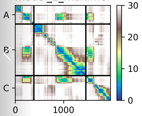
Jan suggests AlphaFold PAE plots can have axis labels, chain dividing lines, multicolor palette and color key. See the attached image for an example.
Begin forwarded message:
From: "Jan Gebauer"
Subject: Re[2]: [chimerax-users] Identifying residues based on PAE plot?
Date: May 6, 2022 at 4:12:21 AM PDT
To: "Tom Goddard"
Hi Tom,
thanks your your quick response and even quick implementation. I am already using the newest daily and really love the function. Just so that you get an idea: I constantly look at multimers where only parts (the interface) are probably predicted correctly. I have to identify them on the sequence basis to compare it between various predictions.
I would be also very helpful if the various selection in the sequence could be printed to the log file. Currently, I select the interface are in the PAE plot and than have to redraw the selection to get the sequence stretch. If you tool would display it's selection syntax for the chains in the log would be great. Like
Selected from PE
#1/B:481-697
#1/C:1-161
As you suggested lines for the differen chains would be helpfull - to better identify the interface.
Here your PAE and a (none-interactive) display of roughly the same complex by one of our local scripts:
Your PAE plot
Our favoured internal visualisation (non interactive however 👎)
(see attached image)
Best
Jan
Attachments (2)
Change History (3)
by , 4 years ago
| Attachment: | Screenshot 2022-05-06 131038.png added |
|---|
comment:1 by , 4 years ago
| Cc: | added |
|---|---|
| Resolution: | → fixed |
| Status: | assigned → closed |
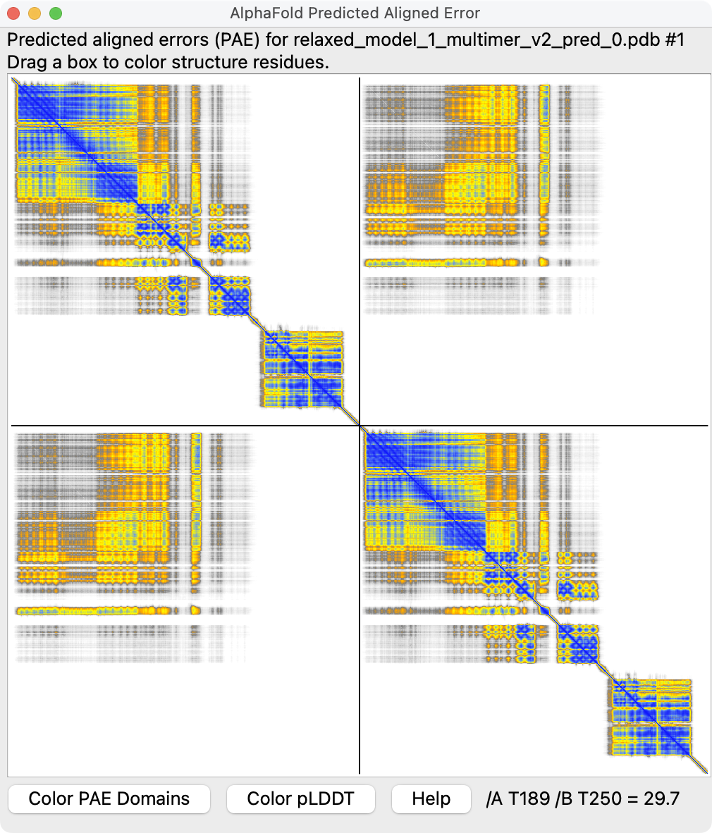
Switched default PAE plot colormap to rainbow making it easier to see gradations. The standard colormap name "pae" is now rainbow, and the former green colormap is called "paegreen". Added context menu entries "Color Plot Rainbow" and "Color Plot Green" in case users prefer the green coloring.
Added chain divider lines to plot, shown by default for multimer structures. Added a context menu entry "Show Chain Divider Lines" to turn them off since they cover a couple residues at each end of a chain in the plot and sometimes it might be desirable to not cover those. The "alphafold pae" command also has a new dividerLines option, default true.
I've attached an example image of a PAE plot with new colors and divider lines.
I probably am not going to add axis scales (chain Ids or residue numbers) or a color key. Those are good for making a figure but hard to implement well. I would probably need to change the implementation to use matplotlib instead QGraphicsScene. The main point of the plots is for interactive use. Making figures for a paper is quite a bit harder and we have too many other priorities.
Screenshot of a better PAE plot from Jan.