Opened 5 years ago
Closed 5 years ago
#5403 closed defect (fixed)
debloat Blast input and output dialogs
| Reported by: | Elaine Meng | Owned by: | Zach Pearson |
|---|---|---|---|
| Priority: | high | Milestone: | 1.3 |
| Component: | Sequence | Version: | |
| Keywords: | Cc: | Eric Pettersen | |
| Blocked By: | Blocking: | ||
| Notify when closed: | Platform: | all | |
| Project: | ChimeraX |
Description
From: Eric Pettersen <pett@…>
Subject: Widget spacing
Date: September 14, 2021 at 12:06:18 PM PDT
Hi Zach,
Elaine pointed out to me that the Blast Protein widget layout puts a lot of space between the various widgets, and as you know screen real estate is kind of at a premium in the ChimeraX interface. Anyway, you can pack the widgets more tightly by using .setContentsMargins(0,0,0,0) on your layout, and possibly .setSpacing(0) as well. The tool.py file in the modeller bundle is an example.
--Eric
Attachments (2)
Change History (7)
comment:1 by , 5 years ago
by , 5 years ago
| Attachment: | Screen Shot 2021-10-13 at 1.38.38 PM.png added |
|---|
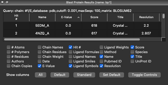
spacing 0, margins normal
comment:2 by , 5 years ago
I think either one is okay, although I feel it would be nice if the "Query:..." text were centered instead of left justified. I have committed a change to ItemTable that will tighten up the spacing between and around the table-control widgets, so let's look at this again tomorrow and see what we think.
comment:3 by , 5 years ago
| Cc: | added |
|---|
comment:4 by , 5 years ago
Spacing in both input and output dialogs of Blast Protein looks fine to me in the 10-14-2021 daily build of 1.4. So from my point of view, this could be resolved as fixed if it's also done the same way in the 1.3 branch. Thanks!
comment:5 by , 5 years ago
| Resolution: | → fixed |
|---|---|
| Status: | assigned → closed |
Great! Fixed in this commit.
I've pushed a partial fix for the tool -- but should I also reduce the margins on the results panel? I think it looks worse without them.